

The objective
Evolve the Acure brand to reflect its clean origins and efficacious products, and to resonate with a younger, more informed consumer.
What we did
We shifted the hierarchy of the brand’s pillars, focusing on efficacy first and foremost. We gave customers reasons to believe in the brand and the products.
The Strategy
We conducted customer and non-customer interviews, user testing, brand perception analyses, market research, and more. We learned that Acure’s key differentiators were simply nice-to-haves for customers — they created added value, but they weren’t the reasons people purchased. Customers cared infinitely more about efficacy, and finding products that solved their concerns. With this, we shifted the hierarchy of the brand’s pillars.
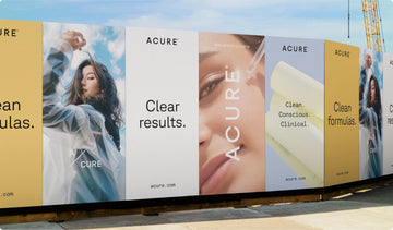
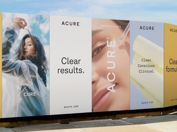
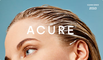
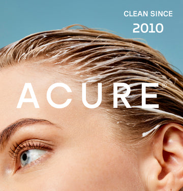
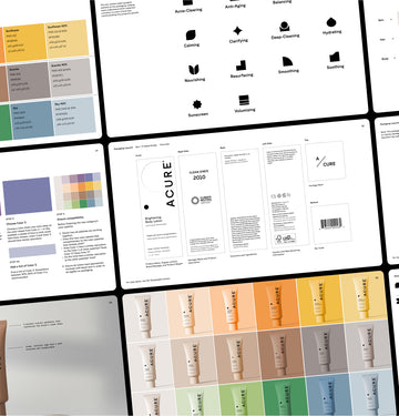
the brand
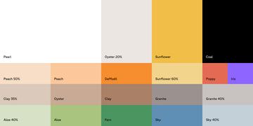
We created a brand system that stayed true to the brand’s roots, while amplifying credibility and efficacy. We developed marks that overtly communicated the brand’s key values, introduced a sans serif and mono typeface that reflected its science-first nature, and evolved the color palette to balance bright and natural.
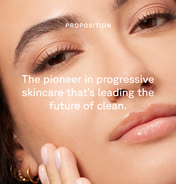
We also refined the logo by cleaning up the letterforms and increasing the weight. The objective was to introduce strength and maturity, solidifying Acure as the pioneer in clean, efficacious skincare.

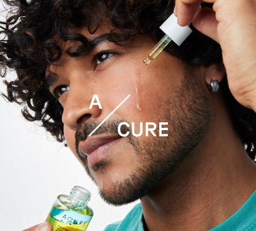
The messaging
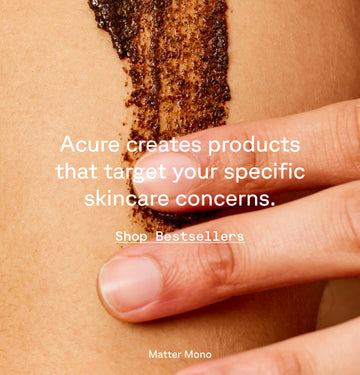
The primary message was efficacy. This was imperative to communicate at every touchpoint, throughout all creative — no matter what.


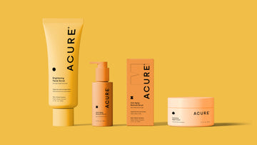
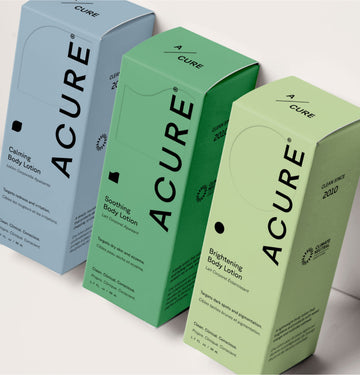
The packaging
The previous packaging design delineated collections by color, with yellow for brightening, green for hydrating, etc. During our research, we discovered that customers only shopped by color, and that they never explored products outside of the collection/color they were familiar with purchasing.
We designed a packaging system where color identifies the category only: skincare, haircare, and body care. This shift prompts discovery across the complete Acure lineup. Customers can now discover products specifically formulated for their skin, hair, and body concerns. We also developed an icon system that further emphasizes the efficacy of each product.
Acure’s new packaging will roll out in 2025.
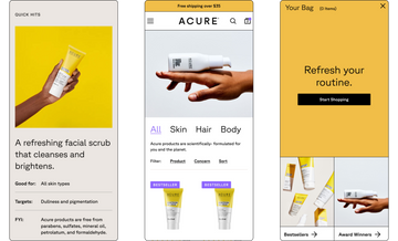
The site
We designed a site experience that let users identify, navigate to, and learn about the products that were right for their skin concerns — replacing decision fatigue with valuable skincare knowledge.
Acure exceeded their sales goals for Q4. CVR increased by 60%, and subscription signups increased by 25%. Plus, the website won Awwwards Site of the Day.
The result
A brand that’s famous for clean, efficacious, and affordable skincare.