
The objective
Optimize the user journey for the quickest path to purchase and ultimately increase site conversion.
What we did


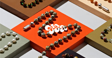
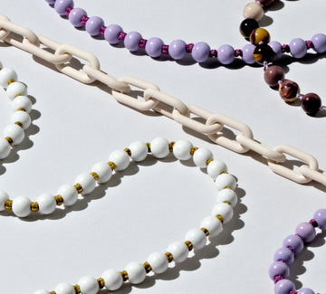
We expanded the brand’s vibrant, funky toolkit. We optimized what existed, and added new elements that would make the site experience clearer and more navigable for users.
The site
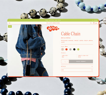
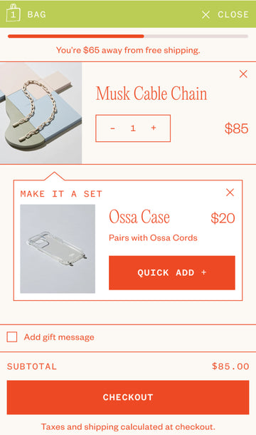
We focused on the most impactful pages for conversion: Homepage, PLP, PDP, and Cart. Through these pages, we built a site experience that guided users appropriately. It was imperative that we educated users about both the product and the required selections — while getting them to check out in as few clicks as possible. We also added marketing moments and social proof to boost the virality of the brand.

“Our decision to work with Mostly Sunny was one of the best investments in our brand. Their thorough training in consumer behavior matched with their clean, sleek, intuitive approach to design made them the exact partners we needed. Couldn’t recommend more highly.”


The result
Endless options, but a clear path forward; a seamless shopping journey; a differentiated, ownable site experience.