

The objective
Build an expert, empathetic brand that clinics and providers wanted to partner with, and patients trusted in their reproductive journey.
What we did


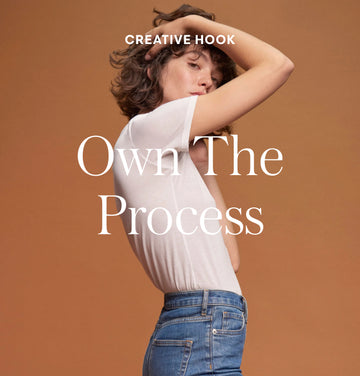
It was critical to strike a balance between expert and approachable — more credible than a startup, and more human than a medical practice.
The strategy
1 in 6 couples need extra help getting pregnant. While common, reproductive issues are shrouded in stigma. Not to mention, the process of IVF or egg freezing is fragmented, opaque, and emotional. For a decision so important, there is such little education available. For a life moment so exciting, the process feels far from.
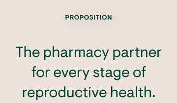
We positioned Prima to be an expert resource for patients — for everything from education, to support, to prescriptions. By bringing transparency to a historically confusing process, and by showing humanity during an emotional journey, Prima could help patients take control of their reproductive health.





The brand
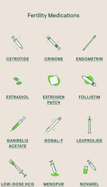
We built a brand system that symbolized strength, femininity, and expertise. The wordmark — with its thick and thin strokes, exaggerated curves, and confident stems — balanced credibility and humanity. Similarly, the linework was intended for two distinct applications — one that depicted expertise, and one that was more organic, human, and approachable. The type system was both approachable and feminine, while the brand colors and the botanical imagery emphasized natural strength.





“Working with Mostly Sunny exceeded expectations. It was a true partnership and the team felt like an extension of our own team. They helped craft the strategic articulation of our brand, and then brought it life visually across digital, print and OOH. It was truly a pleasure to work with them. The team always had a positive and creative solution forward. We could not be happier in how the branding turned out and can't wait to continuing working with them on future projects.”


The messaging
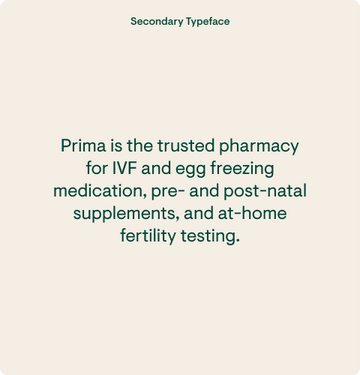
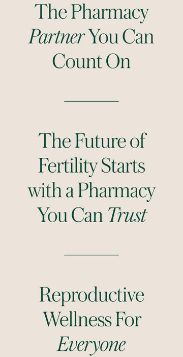
The messaging was approachable, first and foremost. It educated patients in a digestible way, and simultaneously instilled trust in the brand. The tone of voice was equal parts comforting and empowering.

The site
The site experience educated without overwhelming. Users were introduced to the different medications. It was up to the individual to dive as deep or as little as were ready for. They had access to the learn the depths — what the medications did, how to use them, side effects, and more. Users could also seamlessly fill and track their prescriptions. The site was designed to understand the different emotions and experiences that a user would be going through.


The result
An trusted resource for reproductive health; a pharmacy partner during the IVF or egg freezing process; a support system during an emotional journey.